
Fonts should be pretty, and text layout should be easy to read as possible. When publishing on paper, publishers can control the physical format for the presentation. We can assume, for the most part, how someone might hold and read a book or a newspaper. Based on that we can predict how various layouts, typefaces, and letter sizes will affect the readability and aesthetics.
Publishing on the web is a bit more complicated. How exactly a web page will be perceived is difficult to predict. Content publishers adapt with responsive designs and share the responsibility for presentation with browser makers and device makers.

Folks old enough to remember old timey newspapers would recall how narrow their text columns were. Before digital layouts, newspapers were published using hot metal methods called linotype.
Linotype newspapers had narrow columns for practical reasons.
A metal line of type (“line-o-type” ⇝ linotype) also called a slug becomes difficult to work with if it is too long. In particular, the machines assembled text line-by-line. This process requires that all the lines are roughly of equal width. A small line width –2 inches in this case– was apparently the right trade-off.
There were additional reasons for the 8 column layouts of yore that were not just ease of arranging type. For example, the many small columns allowed for more flexibility for laying out ads.
More relevant for us is that a narrow column makes it easier to find the start of the next line after reading one. Larger spacing between lines helps; double-spacing isn’t just a trick to push the page count.
Around 2008, New York Times changed the print layout to a wider 6 column layout. The new column size accommodated 40–45 characters. Since fiddling with linotype slugs is no longer a concern, they were able to focus more on readability.
Newspapers – or print in general – is different from reading on the web in terms of distance from the eye to the text. Different reading distances demand different amounts of precision to follow a line of text.

So the goal here is to figure out a width that is short enough that the reader can find the next line comfortably, and long enough to not require excessive effort to read each line. Too long and the reader will break their rhythm with excessive time spent finding the start of the next line. Too short and the reader will break their rhythm with excessive time spent in saccadian movement.

What’s the optimal line length for the web then?
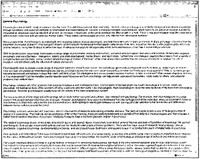
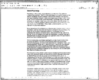
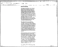
Bernard et al. (2003) studied this very question. Their study looked at three different layouts presented on what would be considered a regular desktop screen.
Examples of the three layouts from the Bernard et al. (2003) paper are presented below and are illustrative of what the test subjects saw.
From the paper (emphasis mine):
No differences were found for either reading time or efficiency for either adults or children. However, adults preferred shorter line lengths to full-screen line lengths. In examining perception of reading efficiency, the results were mixed. For adults, the full text lengths were perceived as providing the optimal amount of scrolling in comparison to the two other narrower line length conditions. The narrowest line length condition was perceived as promoting the highest amount of reader concentration, while the medium line-length condition was considered to be the most optimally presented length for reading.
– Bernard et al. (2003)
Beymer et al. (2005) performed an eye-tracking study along these same lines.
From the paper:
Comparing the wide and narrow formatting conditions, our analysis shows that for narrow formatting, subjects (a) read slightly faster, (b) have fewer regressions, (c) retain more information in a post-test of the material, but (d) tend to abandon the ends of longer paragraphs.
– Beymer et al. (2005)
In other words, there’s a slight preference for narrower columns, but there’s no consensus on whether there’s a significant improvement in reading speed. Some evidence exists to suggest that comprehension is slightly better with narrower columns.
How wide should paragraphs be formatted for optimal reader retention and ease of reading? While everyone is familiar with the narrow, multi-column formatting in newspapers and magazines, research on the issue is not consistent. Early work using printed media favored narrow formatting, while more recent work using computer monitors has favored wider formatting. In this paper, we approach this issue by using eye tracking analysis of users reading material on instructional web pages. In our experimental system, subjects read the material using an instrumented browser that records all HTML content and browser actions, and their eye gaze is recorded using a nonobtrusive, “remote” eye tracker. Comparing the wide and narrow formatting conditions, our analysis shows that for narrow formatting, subjects (a) read slightly faster, (b) have fewer regressions, (c) retain more information in a post-test of the material, but (d) tend to abandon the ends of longer paragraphs.